

Is it a good idea to use the 62.5% em trick?
The main reason people reset the font-size to 10px to make maths easier.
Hi there 👋, I am Anil Verma I am a passionate Full Stack Web Developer who is fascinated by complex engineering problems.
body { font-size:62.5%; }
h1 { font-size: 2.4em; } /* =24px */
p  { font-size: 1.4em; } /* =14px */

The idea is that we're scaling down the root font size
so that each em unit is equal to 10px instead of 16px.

People like this solution because the math becomes way easier.
To get the em equivalent of 17px, you move the decimal (1.7em).
Note —
1rem =16px?
That’s only true if the user hasn’t touched browser default font size! If they change their default font size to 28px, then 1 em will now be 28px instead of 16.
Problems with 62.5%
If you set your base at 10px and you want your elements be 12px, you have to style every single element. You need to define every element individually.
Will get crazy inheritance issues.
Potentially huge accessibility problems for anyone who changes their default font size
Accessibility considerations
The Web Content Accessibility Guidelines (WCAG) state that in order to be accessible, a site should be usable at 200% zoom.
Browser Zooming — —
User can zoom-in, zoom-out on browser based on their needs.
The problem is that zoom is — user have to play with the zoom every time they visit a new site. Wouldn’t it be better if they could set a baseline font size, one that is large enough for them to read comfortably?
Font scaling —
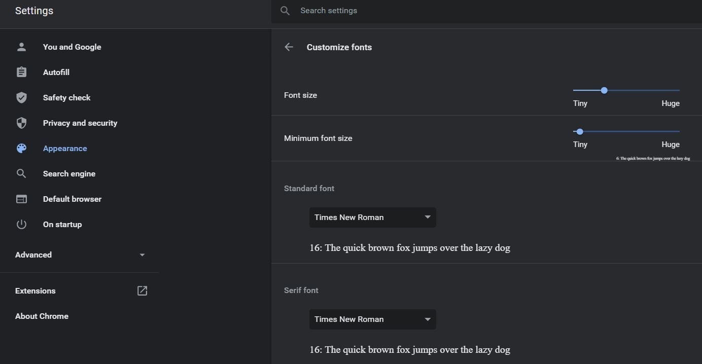
Change default font size in browser
What about the 4.8rem-sized heading? After the user sets their base font size to 20px, this heading will have an effective font size of 60px:
This may seem strange since we actually wanted 4.8em to equal 48px
WHO IS AFFECTED?
Globally, at least billions people have a vision impairment.
More than a quarter of users increase the default font size on their devices.
Happy Learning…👏 👏 👏